For my thesis, I had to rebrand a non-profit organisation. Because of my love for travel, the fact that my horoscope is cancer and I love the color blue, I went for a local diving club. Here you can find the full rebrand process, from initial sketches all the way to the final website. The words in the images are in Dutch but the images should be clear enough.
The current website (opens in new tab) is very basic and not so up-to date. The logo needed to be more simple because it is not very legible in small size; you can't really read the text and the diver just disappears. Because the name is Armada, I researched old diving suits and took inspiration from there.
After looking into lots of different forms and diving suits, my teacher and I decided to go forth with the design on the far right from the image on the left.
Next step was deciding a color palette.
If I had it my way, I probably would've gone for the last two color palettes. The nostalgic "mood" is something I feel very good with. My teacher on the other hand, liked the modern and colors better and was pushing me into that direction. The final result is something I'm very proud of any way.
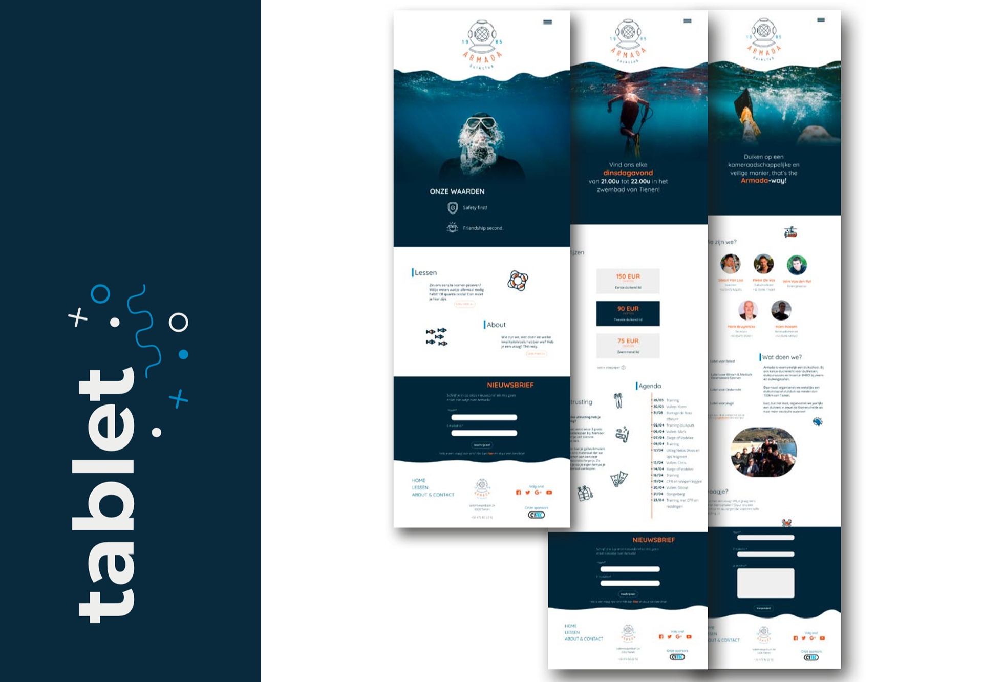
Next step was designing a working website. Honestly, HTML and JavaScript are two languages I just can not figure out. I made the design with Adobe Xd after wireframing.
Because in modern times, people use their phone the most to go online, we always had to work mobile friendly. The design for the website had to be easy to use and not very complicated, especially because I noticed they had quite a lot of older members. The simplicity of the logo had to recur in the website too. Something in which I succeeded pretty good.


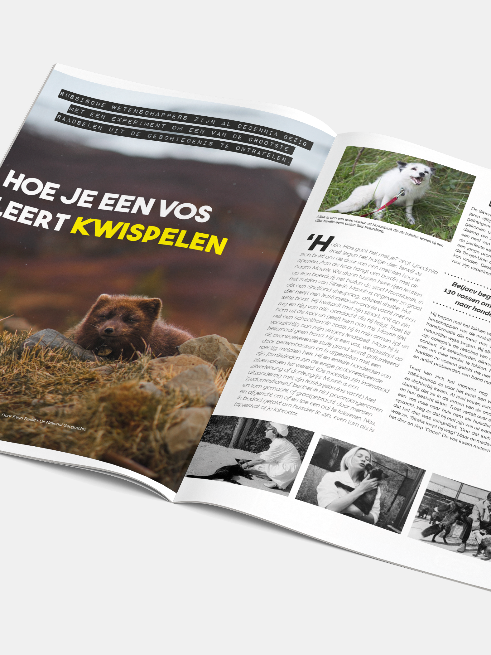
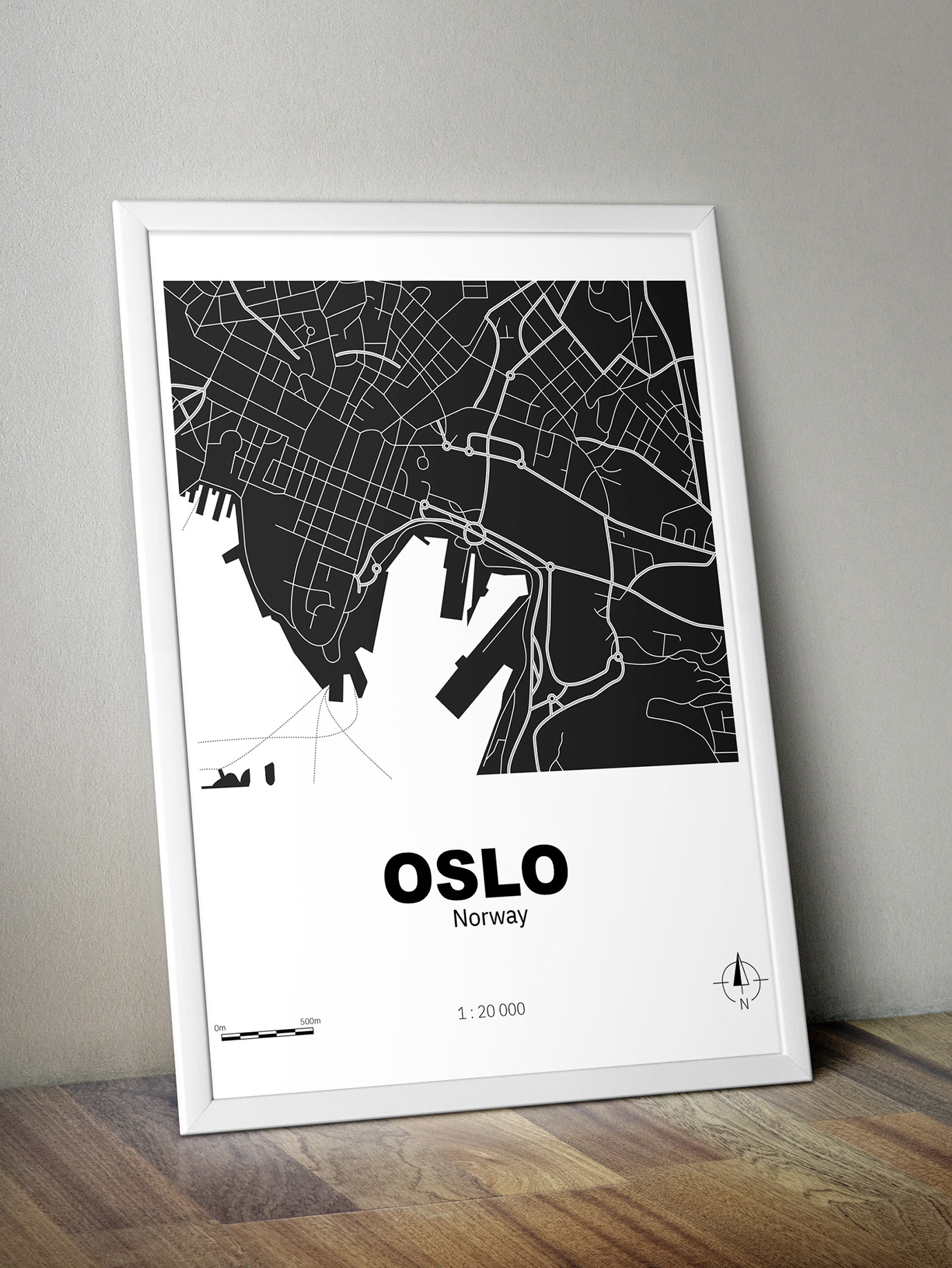
Last but certainly not least, we had to make a leaflet to attract new members. I went all out in Illustrator and also made a custom map to help people locate the diving school.
programs used
- Adobe Illustrator
- Adobe Indesign
- Adobe Xd
- Adobe Illustrator
- Adobe Indesign
- Adobe Xd
photography from Unsplash
Jakob Owens, Johnny Chen and Julian Dufort
Jakob Owens, Johnny Chen and Julian Dufort


